
30 Graphic Design Prompts to Spark Your Creativity
Writerâs block is annoying, but designerâs block is somehow worse.
You sit there with your design software open, staring at a blank artboard while nothing happens.
You scroll Dribbble for âinspirationâ for the third hour in a row, which mostly just makes you feel worse because everyone else seems to have it figured out.
Or maybe you want to practice design, but youâre tired of making yet another fake coffee shop logo youâll never use.
Hereâs the reality: good design needs constraints. A blank canvas with endless options is paralyzing. What you actually need are clear challenges and real problems to solve.
Thatâs exactly what these Graphic Design Prompts are for.
These thirty prompts act like mini design briefs. They force you to make real decisions about typography, color, layout, and concept.
Some simulate client work, others push you into styles you donât usually explore, and a few will probably frustrate you. Thatâs the point.
No fluff. No vague âdesign something coolâ advice. Just prompts that get you designing instead of staring at empty artboards.
Letâs make something.
Brand Identity and Logo Design
1. The Contradiction Brand
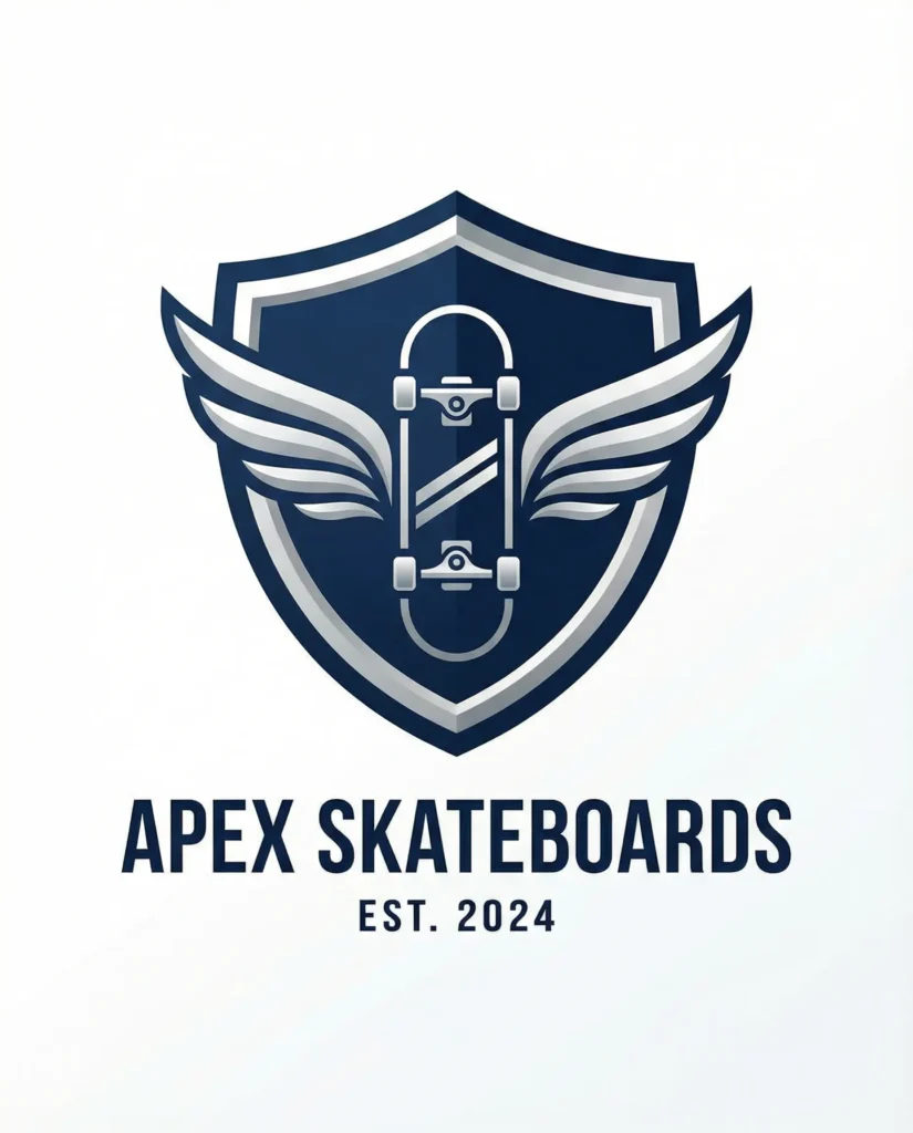
Design a complete brand identity for a company that combines two concepts that don’t typically go together. A luxury hardware store. A minimalist circus. A corporate skateboard brand.
Select your contradiction, then design a logo, color palette, and typography system that effectively integrates both concepts. The challenge is to make it feel cohesive instead of confusing.
2. Wordmark Typography Challenge
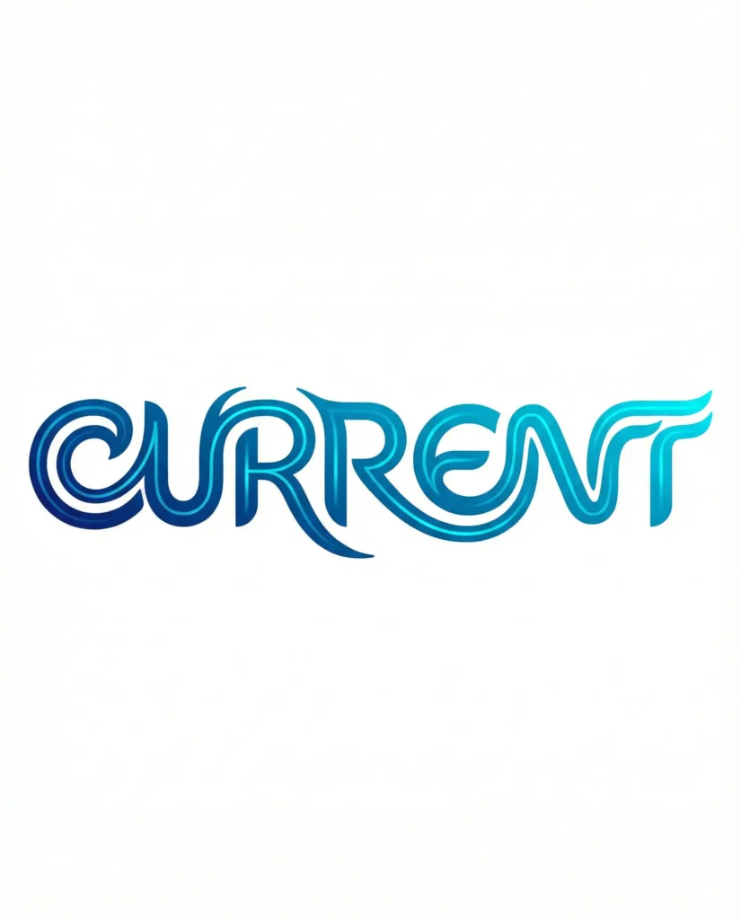
Create a logo using only typography, no symbols, no icons, just letterforms. Pick a real or fictional company name and design a wordmark where the typography itself communicates what the company does.
You can manipulate the letters, but you can’t add separate graphic elements. This forces you to really understand how type communicates beyond just being readable.
3. The Rebrand Exercise
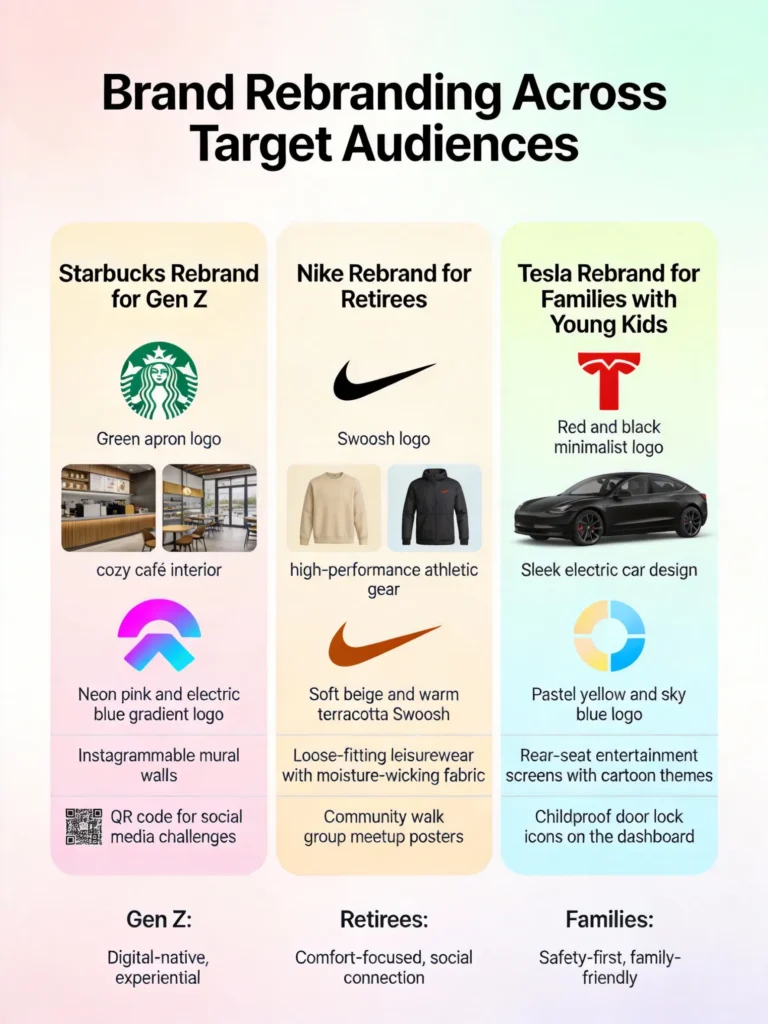
Take an existing major brand and completely rebrand them for a different target audience. Starbucks for Gen Z. Nike for retirees. Tesla for families with young kids.
How do the visual elements change when you shift the audience? What stays and what has to go? This teaches you how branding decisions connect to who you’re actually trying to reach.
4. Monochrome Identity System
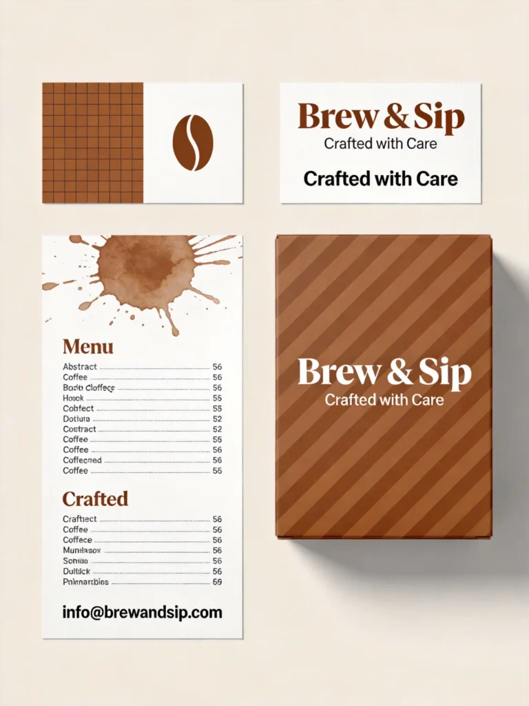
Design a full brand identity using only one color plus black and white. Pick any industry you want, but you only get one color to work with.
This constraint forces you to create visual interest through typography, layout, patterns, and composition instead of relying on color variety to make things interesting.
5. Icon-Based Logo Evolution
Design a logo system where the icon can be used alone, with a wordmark, or in pattern form. Think about how it scales from favicon size to billboard size.
Create at least five different applications showing how the logo adapts to different uses while staying recognizable. This is how actual brand systems work in practice.
Print and Packaging Design
6. Packaging That Tells a Story
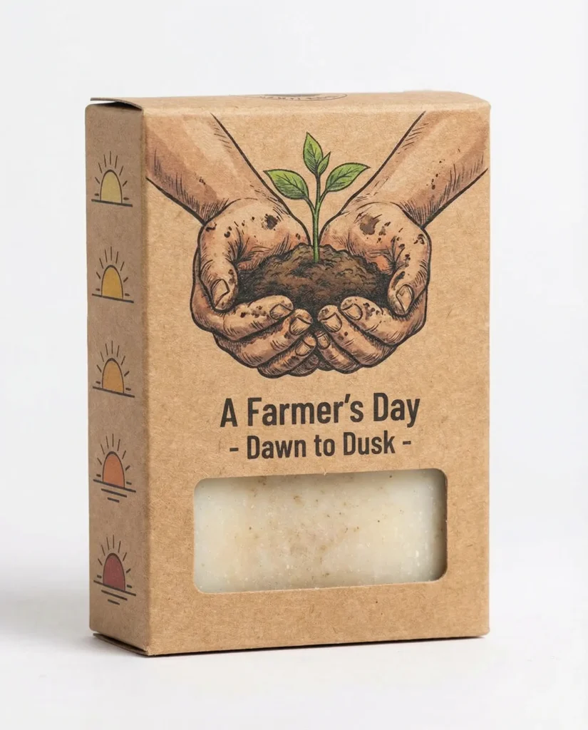
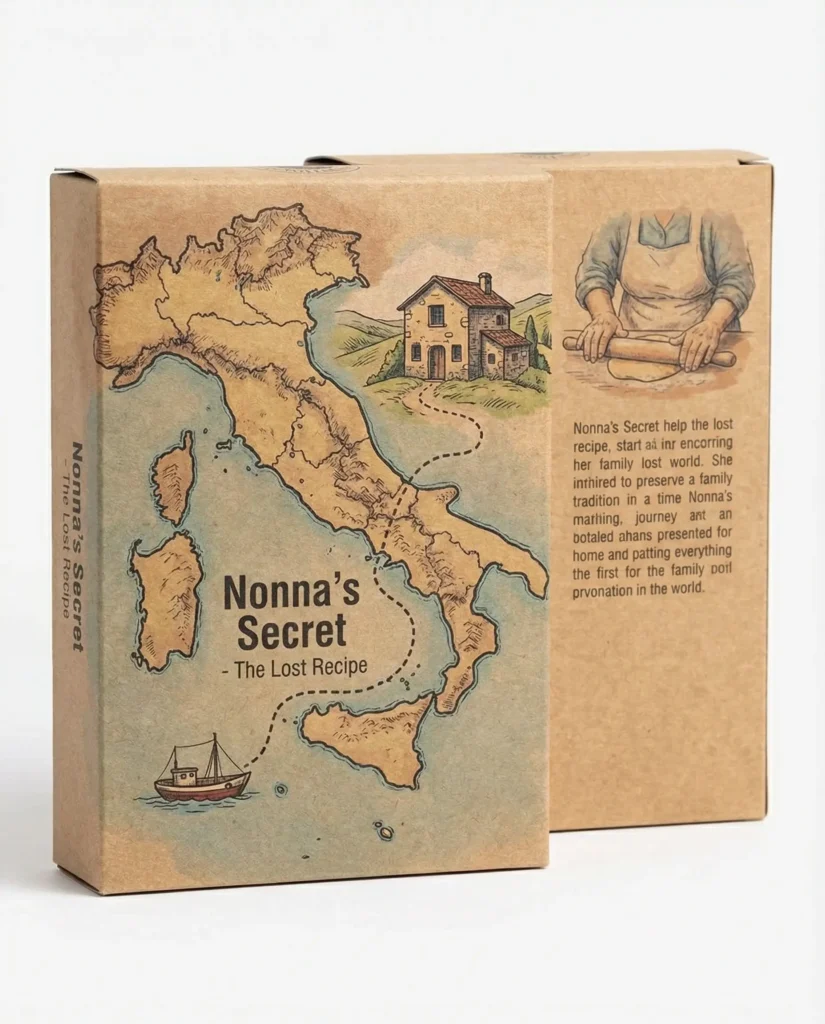
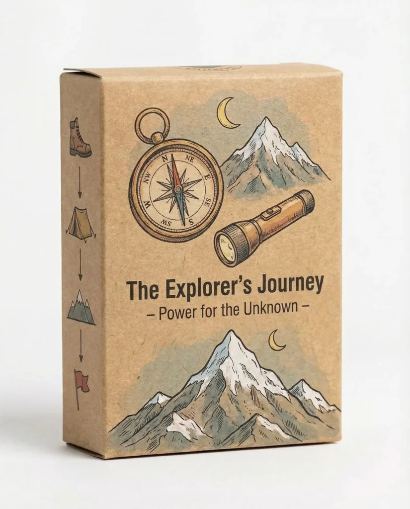
Design product packaging for something mundane (soap, pasta, batteries) that tells a micro-story through the design. The customer should learn something or feel something just from looking at the package.
This isn’t about slapping a story on the back in small text. The design itself needs to communicate narrative through imagery, typography, and layout choices.